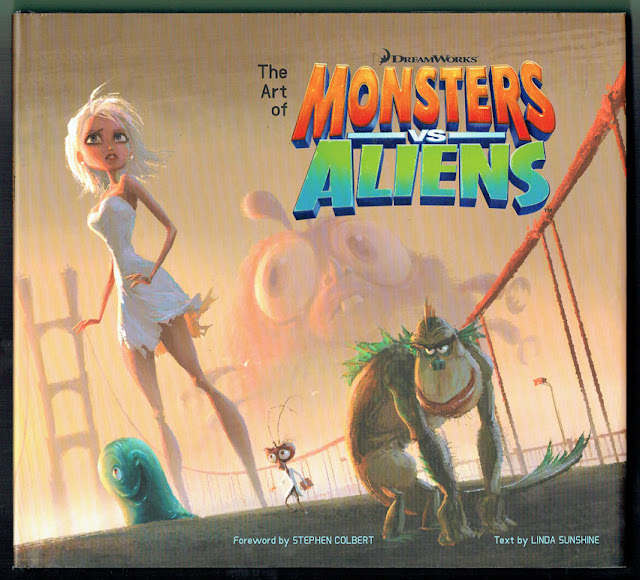
A Look at The Art of Monsters vs. Aliens
Of the many, many parodies/tributes of horror and sci-fi I've seen over the years, DreamWorks Animation's Monsters vs. Aliens (2009) remains one of my all-time favorites. It's got everything for which a fan of Atomic Age creature features could ask: smart humor, a talented cast, great 3D animation, and enough references to horror/sci-fi history (some more overt than others) to put a goofy grin on any geek's face. It may not be as popular as other DreamWorks titles such as Shrek and Kung-Fu Panda, but MvA knows its target audience of monster kids well and delivers accordingly.
Being the fan that I am, I picked up a copy of The Art of Monsters vs. Alien by Linda Sunshine a while back to learn more about the creative process behind the film. Like other "Art of" movie books, Art of MvA is filled with glossy, full-color pictures of concept art and it arranges them in an order that readers can follow from the early stages of the film's development up to the finished product. Read on for my complete review.
Art of MvA begins with an introduction penned by Stephen Colbert (who voiced President Hathaway in MvA), where he waxes nostalgic about the copious amounts of pulp sci-fi he read in his younger days. The book begins with concept art of the characters and provides details about how the evolution of the characters coincided with the evolution of the script. Much of the text covers the challenges that come from computer generated animation, and the tricky balance the animators had to tread when creating the film. They had to providing enough larger-than-life caricatures and sight gags to keep the film funny, while at the same time providing enough realistic coloring, lighting and motion to keep the film visually appealing. The book also covers how much of the MvA's production focused on creating something that can be presented as a top-notch 3D film.
Among the interesting things I learned about MvA through this book:
- Even though MvA's monsters had specific cinematic inspirations, it would appear that the production team had no particular movie alien in mind when it came time to design the film's space invaders. The book contains many pages of concept art that the team produced until they finally arrived at the cephalopod-like Gallaxhar and his army of giant robots and ray gun-wielding clones.
- One of the things that I love about MvA is its style of comedy, which really reminds me of the satirical humor that I read in Mad magazine during the '70s and '80s. It turns out that this connection was deliberate: The production team mentions Mad magazine a few times in the book as an inspiration for their movie. There's even a mention of Jack Davis, one of the artists who helped launch Mad in the '50s, during a discussion of MvA character design. Of course, Harris is the perfect artist to emulate for something like MvA: Not only did Harris contribute his work to Mad for decades, but he also worked on a few of EC Comics' controversial horror comics in the '50s and provided character designs for Mad Monster Party (1967) and The King Kong Show cartoon (1966 - 1969).
- The expansive design of the monsters' prison--Area Fifty-Something--is also rooted in the Atomic Age. According to DreamWorks Animation art director Michael Isaak, "The biggest and most fun challenge was trying to think like a paranoid government official in the 1950s ... If the government really believed there was a monster problem, and they were terrified, what would they do? I figured they'd overbuild, of course! If they caught five monsters, they'd think this was only the tip of the iceburg and they'd be capturing a monster a day for the next hundred years. So they'd build a prison to house thousands of monsters. This adds to the humor because we have one small group of One Flew Over the Cuckoo's Nest misfits in this gigantically over-designed space."
- Not only was MvA designed to be a 3D movie from the very beginning, but they also used its larger characters (e.g., Susan and Insectosaurus) and larger sets (e.g., Gallaxhar's Mothership) as a means of enhancing scale and size in many scenes.
Curiously, Art of MvA omits some key details:
- According to what I've read online, MvA started back in 2002 as an adaptation of Rex Havoc, a horror comic book series about a monster hunter. The book does feature some unused concept art of monster hunters, but the text does not say much about how and why the Rex Havoc concept fell by the wayside.
- Anyone who knows creature feature history can accurately guess which '50s movies inspired MvA's monsters: Attack of the 50 Foot Woman, The Blob, Creature from the Black Lagoon, The Fly, and Mothra. (In fact, I originally thought that Dr. Cockroach's clumsy, oversized head was a playful jab at the clumsy, oversized insect head from Return of the Fly.) Unfortunately, none of these films--nor the geeky fan cultures they inspired--are mentioned in interviews with the MvA production team. Somewhere out there, Forrest J. Ackerman must be spinning in his grave.
- Art of MvA doesn't include any information about the subsequent MvA TV cartoon that ran for one season on Nickelodeon (2013 - 2014). Since this book was published in 2009 before development began for the series, that's to be expected. Unfortunately, the MvA TV series does not have its own "Art of" book.


So much good work here, most of it not used in the film should've been incorporated into the show.
ReplyDelete